THE BUTCHER’S FAVOURITE (and other inspirations of a cutting-edge designer in hot metal)
“My design work for The Cats of Copenhagen was initially very timid but I gradually loosened up my approach until I found myself being so experimental and just using type for their shapes, in an almost gratuitous fashion, that I managed to actually surprise myself. Certain very strange combinations of fonts seemed to somehow coalesce on the paper and I even created unnamable shapes with the actual blocks of type that became quite felicitous; sometimes I felt controlled and almost guided — this was when I was surrounded by case after case of very old, very battered type whose design and conception was borderline and over the line kitsch. I played off the colour and density of the letters against each other. Certain letters looked bossy, authoritative, instructional, directive — I think Joyce secretly hated all forms of control, censorship, and administration in all its manifestations — so I used these letters whenever he spoke of people telling people ‘what to do’! I joined him here by letting his text to become a series of typographical drawings; permissible, I told myself, since this was a book for children that could justifiably be totally playful and ‘ludique’.
 The opening letters of the book say ‘Alas’ and the font, oddly, is called Atlas and is the butcher’s favourite in France, one can only imagine because it is made up of so many stripes reminiscent of slices of meat?! It is a nicely structured font and is a very close cousin to Cassandre’s much esteemed Bifur. The upside down exclamation mark on page 1 evokes the stylised way cats were represented in pottery in the 1960s, and this gave me the idea of actually using as many ‘curled tails’ as possible in the book so that there seems to be a cat preening itself somewhere across every spread.
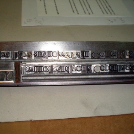
Cats exploits fonts that can work together by respecting a certain consistency of x-height and placing lines that are too black or heavy just diametrically opposite another strong element in the block. A page that took on a life of its own is page 2 where I laid a beautiful and rather long ‘allungati inglese’ on its side after the word ‘bicycles’ so that it seemed to be a symbol denoting that the bicycle had lost perspective and careered out of control, across the page. There is no type so narrow and thin and skiddy as this Nebiolo font. I threw in several beautiful fonts and watched them make peace together on the page. The Helios outline font I used on page 2 is a sort of 3D font from the 1920s and I used two weights of it to animate the page with breathing letters. It was only when I’d finished printing the special edition that I realised one letter in Helios was set upside-down and therefore backwards — the effect of the type gently undulating and coming out off the page was complete!
Most of the fonts in Cats are from the 1880’s through to the 1920’s, my golden age of typography. Very rare metal French, Italian, and German fonts rub shoulders in the book; these were all acquired from various weird and wonderful sources by my atelier (de la Cerisaie) over the last twenty years: Excentriques (Fonderie Doublet), Solus (1880s), Moderne Style (Deberny 1910), Naudin with its wonderful ligatures (used in the colophon). Even the title is set in three fonts: Modern Style, Solar or Solus and Excentriques by Doublet foundry (the M in this alphabet was used as the logo for MacDonald’s burger empire!) are all art nouveau rare fonts, and the word ‘preface’ is set in Artistiques Peignot ca. 1908.”
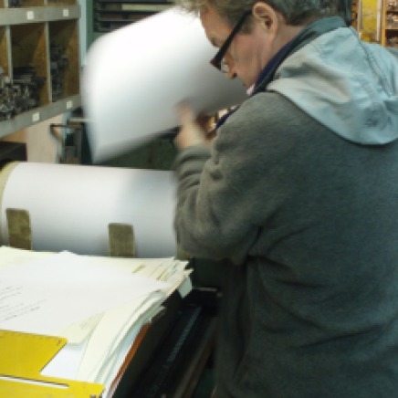
MICHAEL CAINE is the letterpress printer of James Joyce’s THE CATS OF COPENHAGEN (Ithys Press, 2012) and FINN’S HOTEL (Ithys Press, 2013).
Michael Caine is a book artist: printmaker, typographer, publisher (Editions Petropolis), and printer. Under a variety of pseudonyms he has designed, illustrated and produced over 50 livres d’artiste. Michael’s checklist of authors published includes: Beckett, Crevel, Lorca, Neruda, Pound, and now, Joyce. Based in Paris since 1990, he has created, set and hand-printed over 130 commissioned works for the ‘creme de la creme’ of the European bibliophile circle, film directors, and gourmet restaurants. He has employed a wondrously expressive array of rare, historic Italian and French typefaces in this specially commissioned Ithys Press first edition of James Joyce’s story for children. 


I knew something important was happening but this exceeds all expectations. Absolutely stunning. Congratulations to all. Can’t wait to see it.